Checkout Field Editor
Configure custom checkout fields in RepairPlugin — add text, dropdowns, checkboxes, plain text displays, and conditional logic to collect the info your repair shop needs.
What can you do with this?
- Show, hide, and reorder default fields (Name, Phone, Email, Notes, Address) on the checkout form
- Add custom fields of any type: text, email, number, textarea, dropdown, checkbox, radio, or pattern
- Display static informational text on the checkout form using a "Plain text" field type -- perfect for terms, disclaimers, or instructions that don't need customer input
- Set up conditional logic so fields only appear based on what the customer selects
- Limit fields to specific delivery methods (e.g., show a return address field only for "Ship device")
- Use custom field values in email notifications and webhooks for seamless follow-up
Where to find it
- In the WordPress admin, go to RepairPlugin in the left sidebar.
- Click Settings.
- In the settings sidebar, click Checkout & Discount.
- Scroll down past the Service Methods and Payment Methods sections to the Checkout Field Editor section.
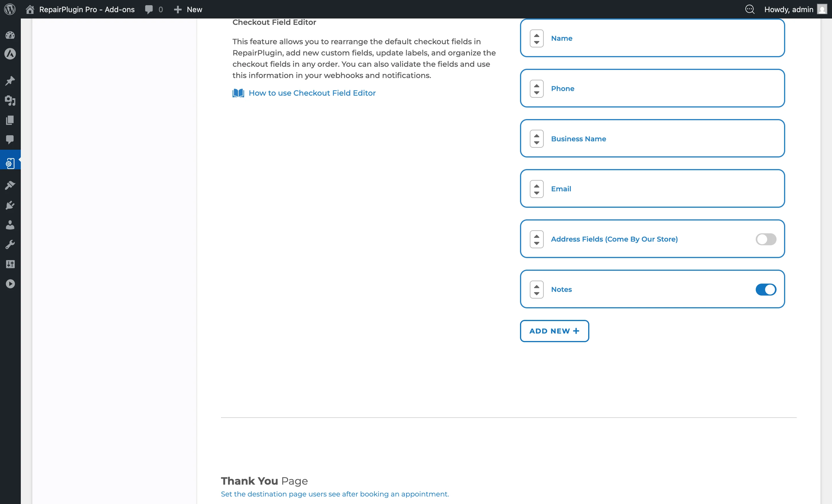
The field editor shows all default and custom fields in their current order.
How to set it up
Reordering Fields
All checkout fields (both default and custom) can be rearranged:
- Locate the field you want to move.
- Use the drag handles (up/down arrows) on the left side of each field.
- Move the field to your desired position.
- Click Save at the bottom of the page.
The checkout form on the frontend reflects the new order immediately after saving.
Enabling or Disabling Default Fields
Some default fields have a switch:
- Locate the default field (e.g., Notes, Address Fields).
- Switch it on to show the field at checkout.
- Switch it off to hide the field.
- Save the page.
The Notes field can be independently enabled or disabled. Address fields (Come By Our Store) can also be switched on or off. Core fields like Name, Phone, and Email are always required and can't be disabled.
Adding a New Custom Field
- Click the Add New + button at the bottom of the field list.
- The page reloads with a new custom field added at the end of the list.
- Configure the field's settings (see field options below).
- Save the page.
Editing a Custom Field
Expand a custom field by clicking its row. You can then configure:
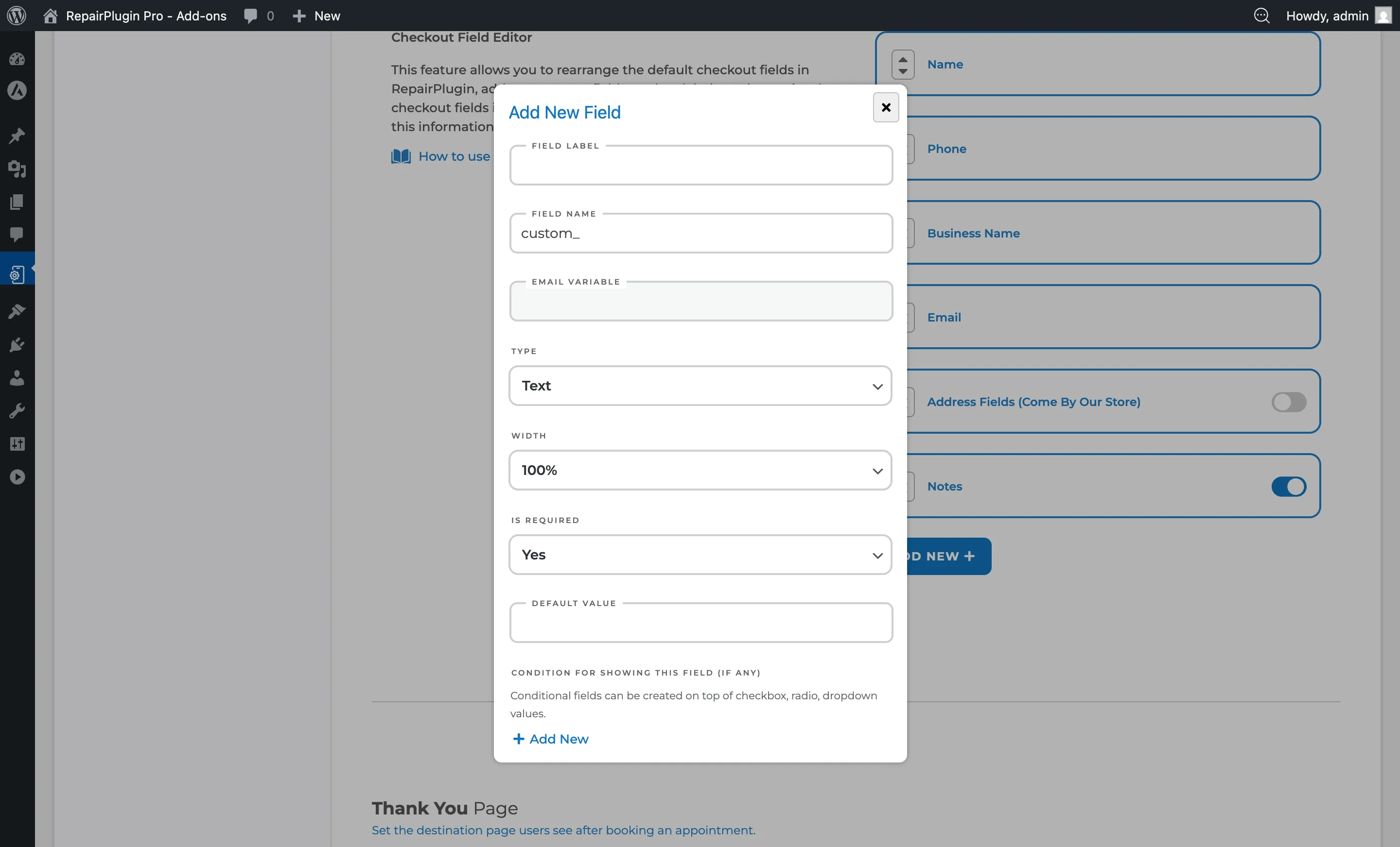
- Field Label -- The label shown to the customer. Supports translations via the globe icon.
- Field Name -- The internal identifier (auto-generated from the label, prefixed with
custom_). This determines the email variable name. - Email Variable -- A read-only variable name you can use in notification templates to insert the field's value (e.g.,
{custom_device_passcode}). - Field Type -- The type of input or display (see Field Types below).
- Options -- For Dropdown, Checkbox, and Radio fields: the selectable options.
- Options Display -- For Checkbox and Radio: Inline (side by side) or Stacked (vertical).
- Width -- The field width on the checkout form: 100%, 75%, 50%, or 25%.
- Required -- Whether the field is mandatory. Options: Required / Optional.
- Default Value -- A pre-filled value for Text, Email, Number, and Textarea fields.
- Condition for showing this field -- Conditional visibility rules (see below).
- Service Methods -- Which delivery methods the field is visible for (see below).
Deleting a Custom Field
- Expand the custom field.
- Click the trash icon at the top right of the field.
- Confirm the deletion.
The field and all its data are permanently removed.
Field Types
When adding a custom field, select one of the following types:
| Type | Description |
|---|---|
| Text | Single-line text input. Best for short answers: names, passcodes, reference numbers. |
| Email input with automatic format validation. | |
| Number | Numeric input only. Useful for quantities, codes, or reference numbers. |
| Textarea | Multi-line text field. Suitable for longer messages, notes, or instructions. |
| Dropdown | A select list where the customer picks one option from predefined choices. |
| Checkbox | One or more selectable options. Used for confirmations, multi-select, or acknowledgements. |
| Radio | Single-selection from a list of options. Used when exactly one choice is required. |
| Pattern | Text input that enforces a specific format pattern. Useful for serial numbers or formatted codes. |
| Plain text | Read-only static text displayed on the checkout form. The value is set by the admin and can't be edited by the customer. Useful for terms, disclaimers, or informational text. Supports translations via the globe icon. |
Configuring Options (Dropdown, Checkbox, Radio)
For field types that have selectable options:
- Under the Options section of the field, click Add New.
- Enter the label for the option.
- Repeat for each option.
- Use the drag handles to reorder options.
- Each option supports translations via the globe icon.
Setting Up Conditional Fields
Conditional logic lets you show or hide a custom field based on the customer's selection in another field:
- Create a Checkbox, Radio, or Dropdown field with options (this is the "trigger" field).
- Create a second field (this is the "dependent" field).
- In the dependent field, locate Condition for showing this field.
- Select the trigger field from the dropdown.
- Select which option value triggers visibility.
- If multiple conditions exist, set the Conditions Relation to determine if all conditions must match or any single condition.
Example: You have a Radio field "Lock Type" with options "Passcode" and "Pattern". You add a Text field "Enter your passcode" with a condition: show only when "Lock Type" equals "Passcode".
Important: Conditional logic only works with Checkbox, Radio, and Dropdown trigger fields. Plain text fields can't be used as triggers.
Service Method Visibility
Each custom field can be limited to specific service methods:
- In the field's settings, locate the Service Methods section.
- Check the delivery methods where this field should appear:
- Come by our store
- Ship device
- Pickup service
- Repair on your location
- At least one service method must be selected.
Only customers using one of the selected service methods will see this field at checkout. This is useful for collecting delivery-specific information (e.g., a return address field only for "Ship device").
Translating Field Labels and Options
Both field labels and option labels support multi-language translations:
- Click the globe icon next to the field label or option label.
- Enter translations for each configured language.
- Save the translations.
Settings reference
| Setting | Description | Default | Customers see |
|---|---|---|---|
| Field Label | Sets the label text displayed above or beside the field on the checkout form | empty | This label appears next to the field when filling out the checkout form. |
| Field Type | Determines the input type and validation behavior of the field. Options: Text, Email, Number, Textarea, Dropdown, Checkbox, Radio, Pattern, Plain text | Text | Changes how the field looks and behaves -- single line, multi-line, select list, checkboxes, etc. |
| Width | Controls how much horizontal space the field takes up on the checkout form. Options: 25% / 50% / 75% / 100% | 100% | Smaller widths let multiple fields appear side by side on the same row. |
| Required | When set to Required, the customer must fill in this field before they can submit the booking. Options: Required / Optional | Optional | Required fields show a validation error if left empty. Optional fields can be skipped. |
| Default Value | Pre-fills the field with the specified value when the checkout form loads | empty | A pre-filled value that they can accept or change. |
| Setting | Description | Default | Customers see |
| --- | --- | --- | --- |
| Options Display | Controls whether options are displayed side by side (Inline) or vertically (Stacked). Options: Inline / Stacked | Stacked | Affects the visual layout of the option list in the checkout form. |
| Setting | Description | Default | Customers see |
| --- | --- | --- | --- |
| Condition for showing this field | Hides the field until the customer selects a specific option in a trigger field | no condition (always visible) | The field appears dynamically when the condition is met, keeping the checkout form clean and focused. |
| Conditions Relation | When multiple conditions are set, determines whether any single condition or all conditions must be met. Options: Any / All | Any | Controls the logic for when the field becomes visible. |
| Setting | Description | Default | Customers see |
|---|---|---|---|
| Service Methods | Restricts the field to only appear when the customer has selected one of the checked delivery methods. Options: Come by our store / Ship device / Pickup service / Repair on your location | all methods selected | The field is hidden when using a delivery method that isn't selected. |
Using Custom Fields in Notifications and Webhooks
Custom field values are available through email variable placeholders (shown in the Email Variable read-only field). You can insert these variables into notification templates under Settings > Notifications & Quotes. The same data is also passed through webhooks for integration with external systems.
Frequently asked questions
Can I make the Name, Phone, or Email fields optional?
No. These core fields are always required and can't be disabled. You can reorder them, but they'll always appear on the checkout form.
Can I use a text field as a trigger for conditional logic?
No. Conditional logic only works with Checkbox, Radio, and Dropdown fields as triggers. Text, Email, Number, Textarea, and Pattern fields can't be used as trigger fields.
How do I use custom field data in emails?
Each custom field has an Email Variable (e.g., {custom_device_passcode}) shown in read-only text when you expand the field. Copy that variable and paste it into your email templates under Settings > Notifications & Quotes.